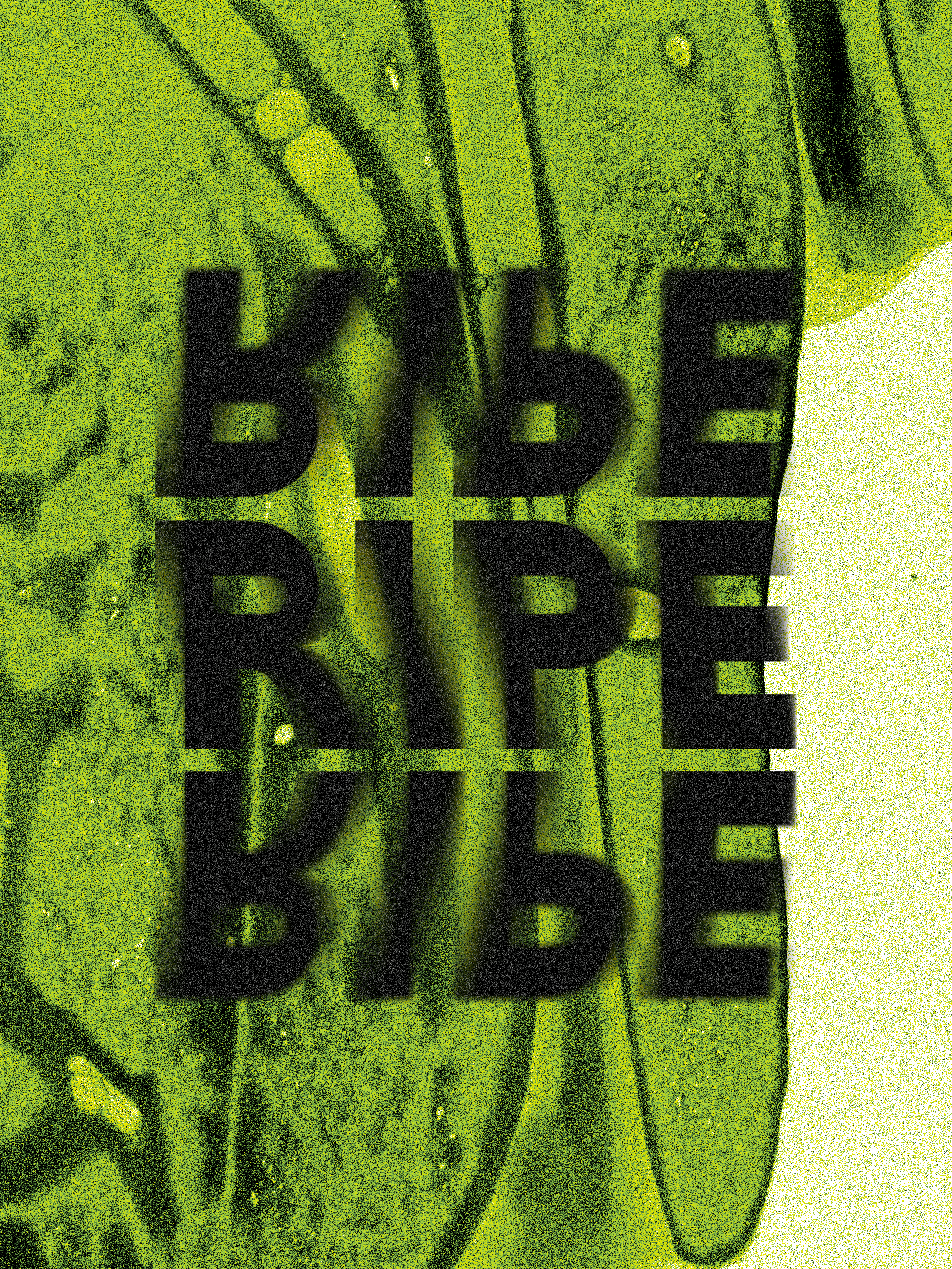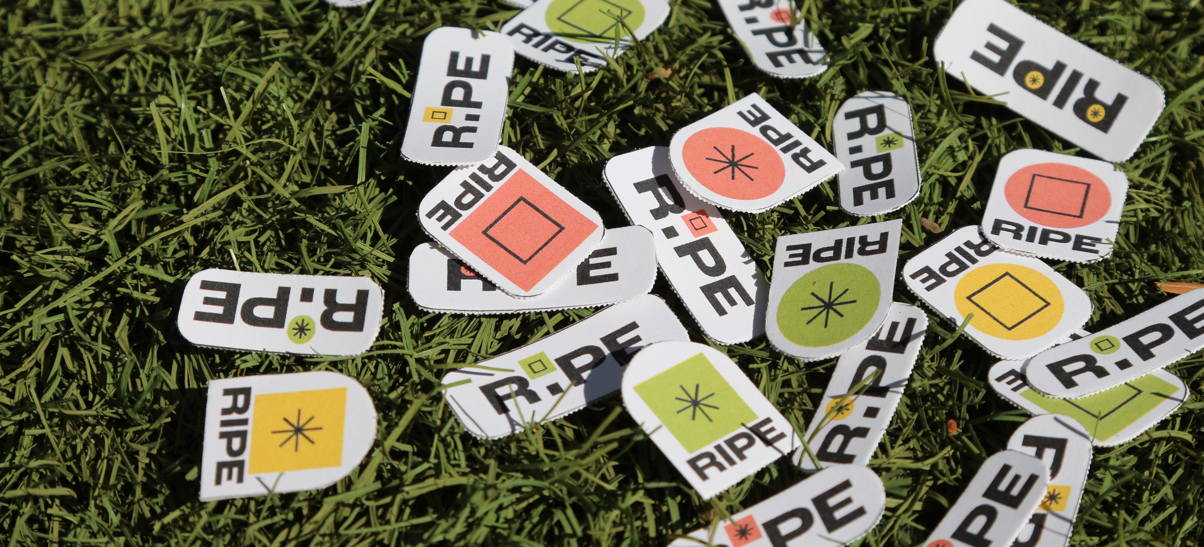
BRIEF: RIPE UPDATE
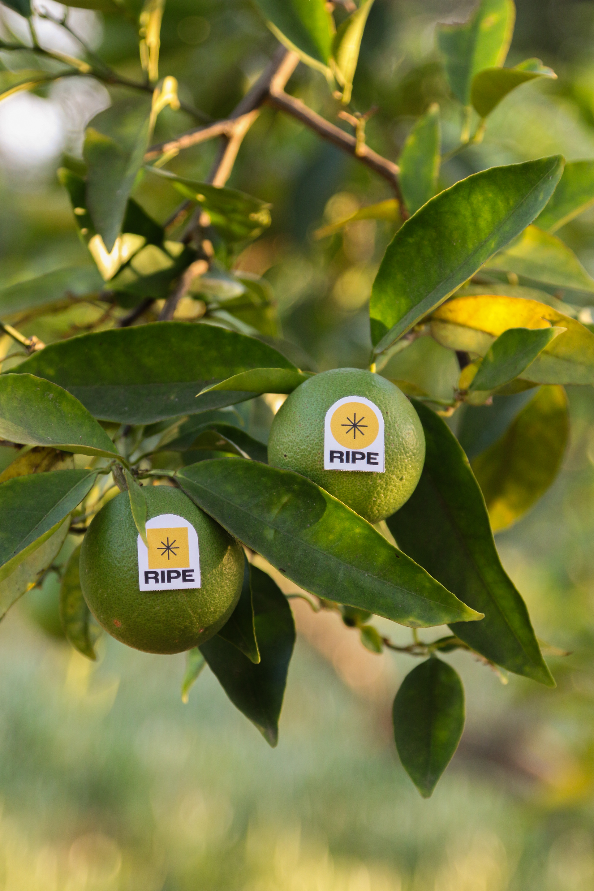
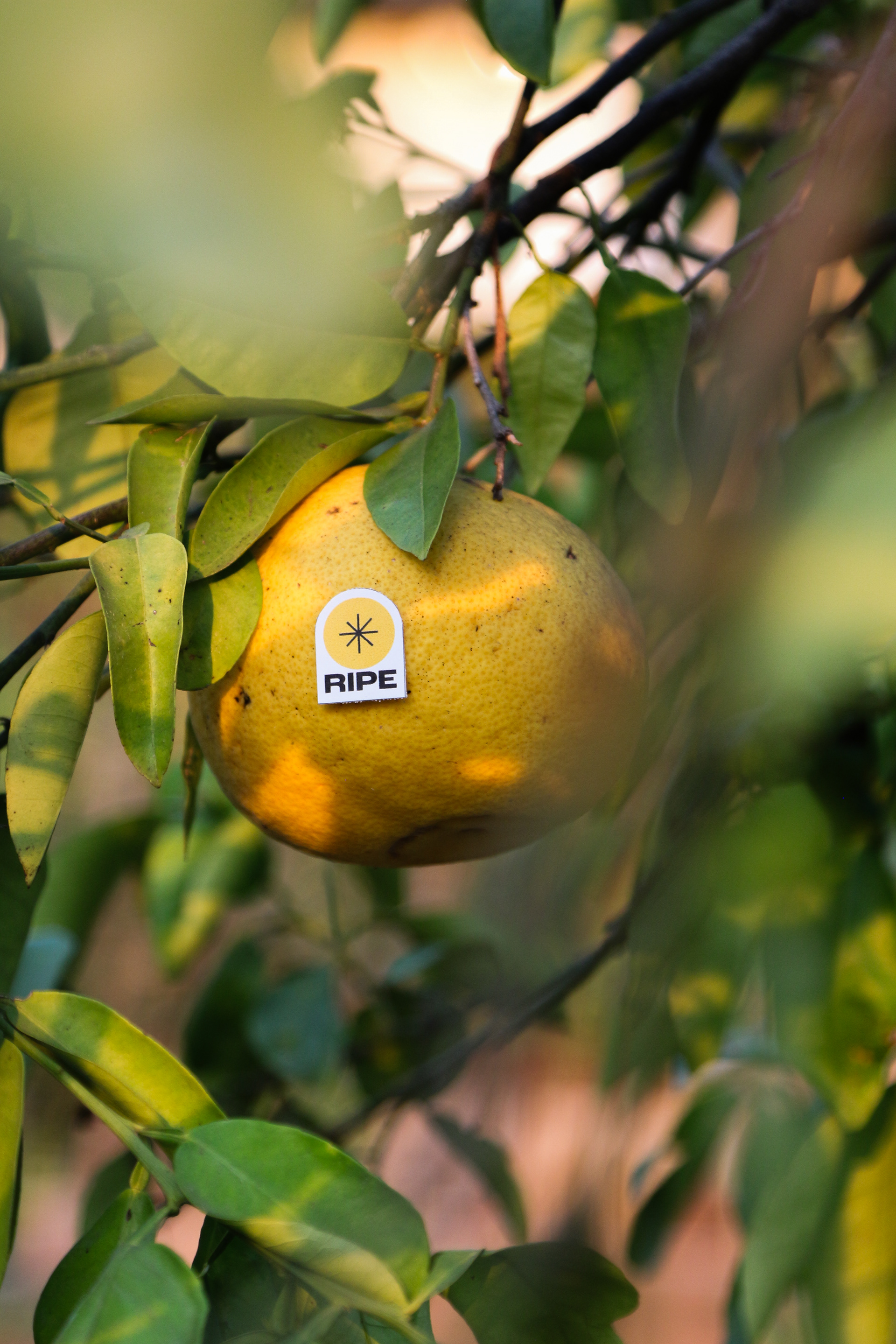
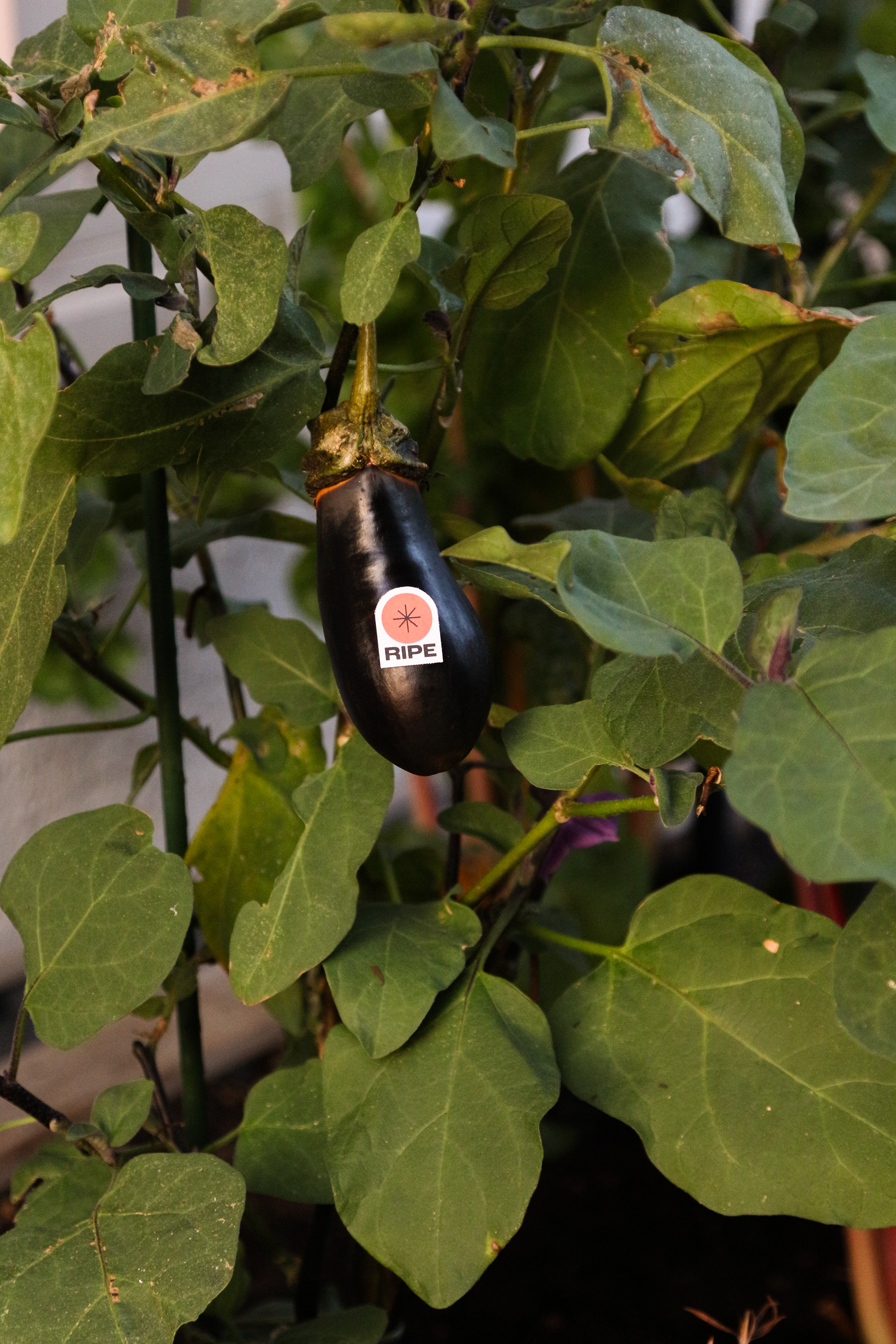
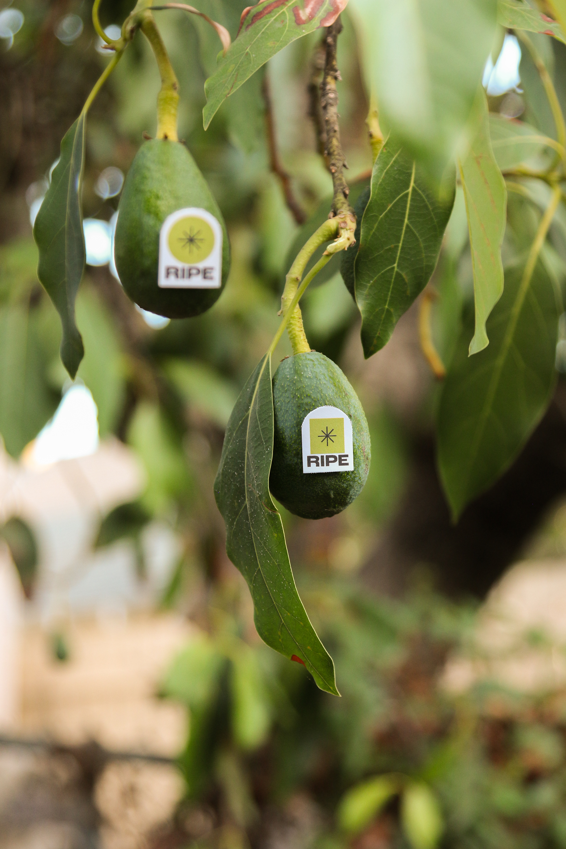
While staying in San Diego, surrounded by fruit trees like avocados, lemons, and pomegranates, I was inspired to revisit this project and reflect on the connection between nature and design. On review, I saw an opportunity to refine the sticker shapes and simplify the visuals, removing excess text to create a design that aligned with the project’s goal: clear, straightforward communication.
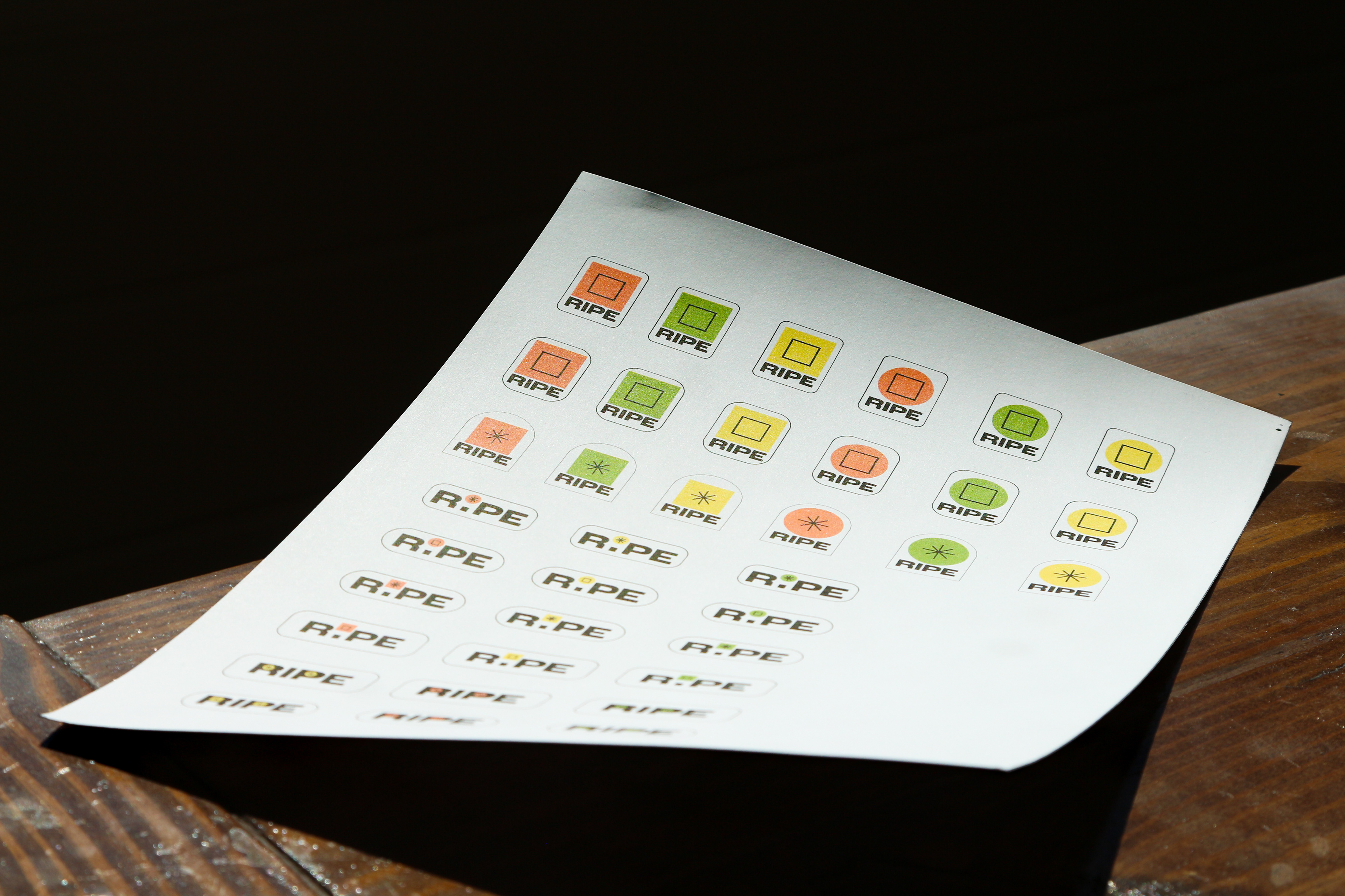
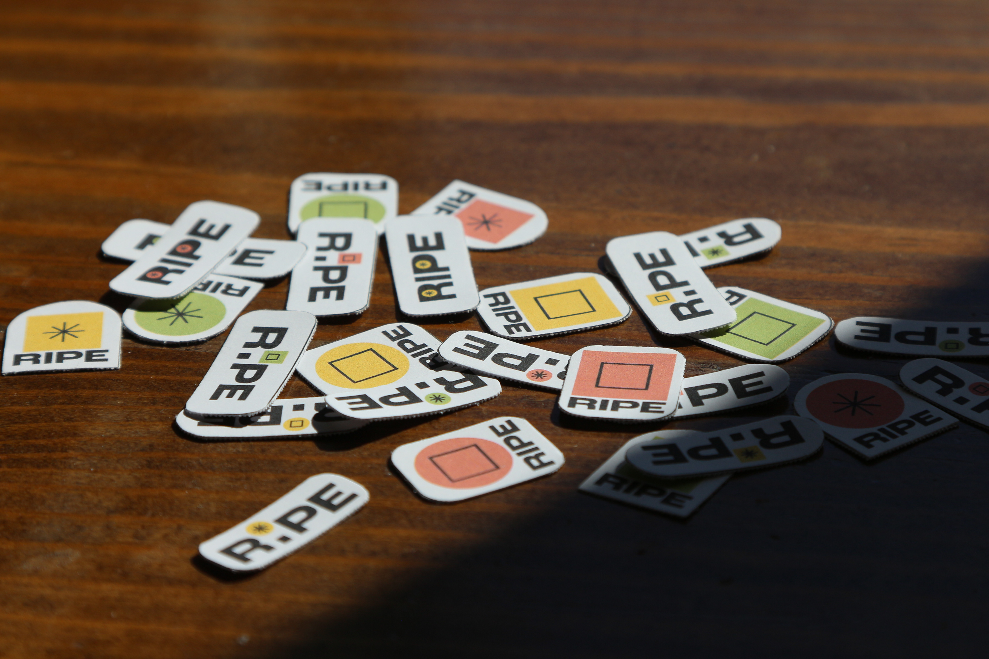
STICKER UPDATES
The redesigned stickers embrace simplicity and functionality, featuring refined shapes and minimal text for clarity.
CAMPAIGN CONCEPTS
Testing on local fruit trees highlighted their functionality, complemented by the campaign concept, “Fresh as the Day it Was Picked,” celebrating produce freshness from farm to table.